Want a heads up when a new story drops? Subscribe here.
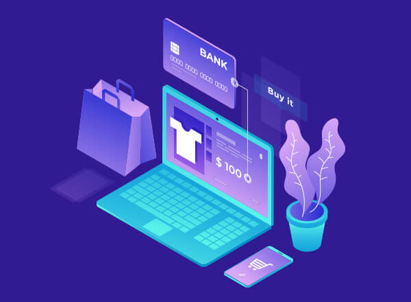
How can businesses adapt to a Covid-19 world where consumers are largely confined to their homes, communities, and towns? As the Internet became the #1 place people could go, a major shift that successful brands have been quick to make is to improve their online visibility, strengthen their digital presence, and enhance their website’s user experience. Looking for the best eCommerce website design turned essential.
Table of Contents
The Shift to Digital Economy

Online Shop Open
2020 promised to be a record-breaking year of growth across all sectors of the economy. With the onset of the pandemic, all went to a sudden halt. Coffee shops, major retail brands, and small clothing stores lost most of their foot traffic, and demand for fashion accessories and electronic devices dried up.
Hand sanitizers, face masks, and toilet paper turned to be the new hot commodities. Many non-essential businesses soon began to feel the pain. Some are finding success while others are struggling to stay afloat in a marketplace that may be changed forever.
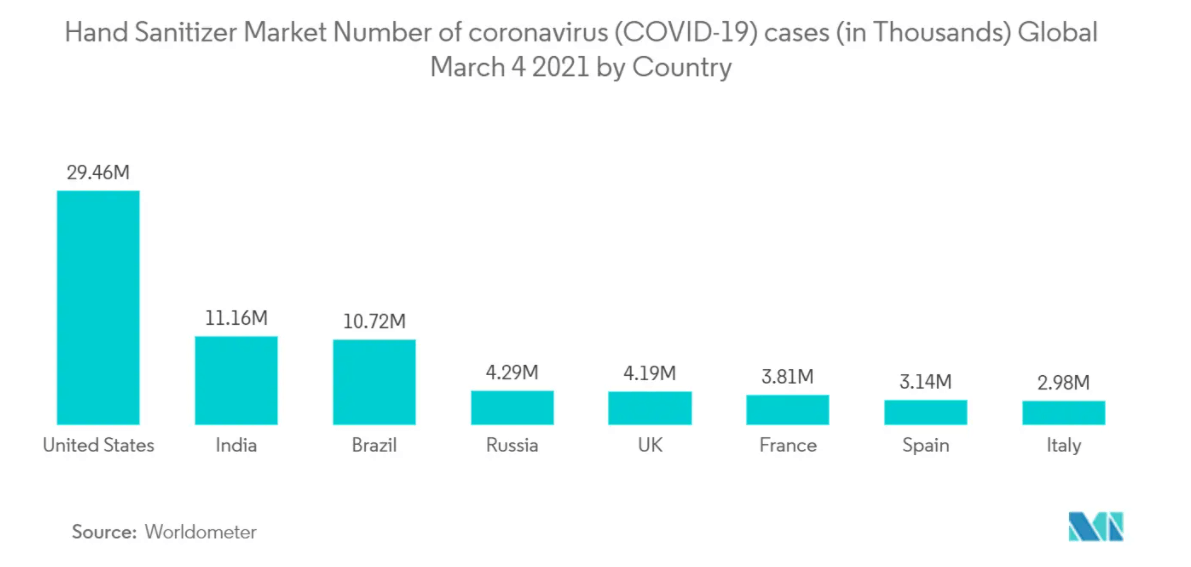
Sanitizer Statistics
In 2021, good e-commerce website design is more important than ever, as websites are one of the main channels to interact with customers. A recipe for good web design and brand success looks like a combination of users experiencing aesthetic pleasure, a simple and easy-to-navigate interface, and vivid accents.
Like the one crowdsourced video blog, Nowness incorporates on their website.
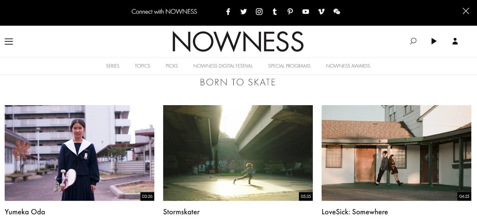
Nowness Website Homepage
Nowness- an award-winning website that creates interactive user experiences with the use of content from independent creatives.
The creators of the website design combine big thumbnails with subtle typography to create an impactful video library. Their approach is a wonderful way to create a storytelling experience in an innovative and captivating way.
To help you successfully incorporate the most fitting website designs for your business here is a list of designs to consider.
Best E-commerce Website Design Trends

Thank You for Shopping with Us
The 7 best eCommerce website design trends for businesses to keep their eye on our use of realistic textures, minimalism, advanced gradients, neutral background colors, creative animations, onboarding questionnaires, and a focus on social causes.
-
Use of Realistic Textures
Visual elements look much more realistic today because web designers have long been experimenting with stone, wood, plastic, metal, glass, and other lifelike textures. They can give a realistic, tactile feel to the interface, making it look more familiar with things that we come across in real life.
While textures come in different types to evoke experiences and emotions, they can be categorized based on prominence and realism. Prominence refers to the extent to which a texture stands out and catches attention. Bold textures capture interest and imagination and help establish a brand’s identity. Subtle textures, on the other hand, give a website a sense of warmth and personality.
In e-commerce website design, realism refers to the extent to which a texture looks like a lifelike texture. It can be anything tangible such as linen, carpet, or grass which can make a website more immersive.
Neumorphism perfectly reflects the idea of realism and is a trend that has had a prominent influence on website designs over the past couple of years.
Tesla Smart App by Dmitri Gavrisov – Source Dribbble
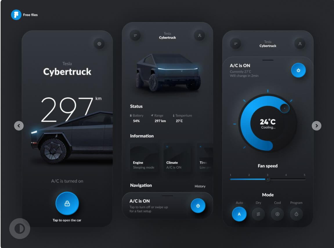
Neumorphism Web Design
-
Minimalism
Minimalism continues to be relevant in 2021, and designs that emphasize simplicity are more frequently seen. The main principles of minimalism are:
- No excess textures, shadows, colors, and color transitions
- Hidden navigation
- User-friendly interface
- No extra buttons
Minimalism or the art of less is about broken composition, transitions, and experimenting with colors. In its essence, it is a technique associated with extreme simplicity and sparseness of detail.

Jazz FM Romania
-
Advanced Gradients
Color transitions or gradients involve blending from one shade to another to create a new color and unique effects. In 2021, gradients have become more sophisticated and combine several color palettes.
Gradients are also mixed with shadows, glass morphism, and 3D graphics. Such use of advanced color schemes allows designers to present a product as unique and showcase it as innovation.
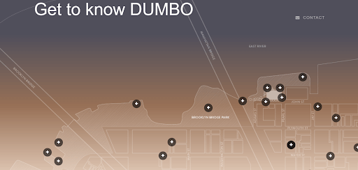
Get to Know Dumbo
-
Neutral Background Colors
Bright colors set atmosphere and mood and allow website designers to express a more positive vibe. Neutral colors, on the other hand, are visually restful and create a calming effect. They are also quite versatile, ranging from black, taupe, and gray to tan, beige, and white.
In addition to traditional neutrals that easily come to mind, designers have expanded the color palette to include new shades that go with just about everything. Such neutrals are, for example, light mauve, sage green, muted blue, charcoal, and earthy red.
Eleven Plants for Dum-Dums & Cool Ppl

Eleven Plants for Dum-Dums & Cool Ppl
Even simple and soft colors such as brown, white, and gray give web designers tremendous freedom in choosing and mixing hues. And while there is always room for vibrancy and bright colors, designs drenched in saturation look visually heavy and can send the eye darting from one element to the next. Neutral background colors work really well in providing a spotlight for other elements to stand out.
-
Creative Animations
There are plenty of benefits to using animations in web design. To begin with, animated content comes in a great variety, from experimental, cut-out, and puppetry to rotoscope, minimalistic, and realistic. Second, eye-catching animations grab the attention of users and drive engagement.
In the age of constant entertainment and information overload, brands are in fierce competition to be heard and seen by consumers. Cutting through the clutter and staying ahead of the curve with consumers is no easy feat.
Luckily, using animation is one engagement tactic that is working in any brand’s favor. A moving or brightly colored element immediately grabs attention and the more intriguing and original it is, the better the chances to break away from the crowd.
According to one study from Behavior & Information Technology, brands have 50 milliseconds or .05 seconds to create a good first impression. Animation can be an excellent attention grabber and an incentive for users to remain on a brand’s website.
SaaS Website Design for an HR Recruiting Platform
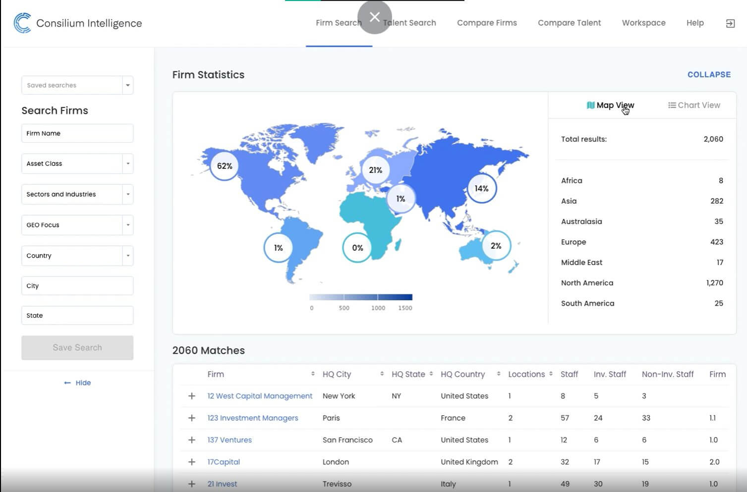
Consilium Intelligence Animation
Tip: Hundreds of growing businesses use Socialfix to create a visually appealing design and showcase their products.

-
Use Onboarding Questionnaires for Best Ecommerce Website
Instead of having visitors read product pages, businesses are increasingly using questionnaires to engage with customers and market their products. Some examples of survey questions are:
- How can we improve our product?
- Which of the following words describes our service/product? (life-saving, OK but there are some issues, great)
- Would you recommend this product to others?
- How well does our product/service meet your needs? (very well, well, badly)
A product survey may look like a feedback questionnaire at first. Yet, an onboarding quiz can be a great way to engage with prospective customers and make them feel like they are part of the service.
-
Showcase Social, Ethical, and Environmental Causes
Almost a year and a half into the pandemic, we have seen a number of social, economic, and ethical issues arise. From school closures and an increase in domestic violence to devastating industries, business closures, and hundreds of millions of jobs lost, the economic and social costs are many.
The pandemic has had a profound impact on the wellbeing and livelihood of millions of people worldwide, especially vulnerable groups such as temporary, part-time, and low-skilled workers, the self-employed, women, young people, children, and low-income households.
To address rising inequalities and poverty, it is vital to engage “vulnerable voices, for example through citizen engagement platforms… to reduce barriers to receiving assistance” (World Bank).
Brands have been up for the task of embracing social causes and showcasing impactful and meaningful e-commerce website designs. In 2021, we already see many businesses rallying around social, economic, ethical, and environmental causes and engaging with customers on a deeper level.
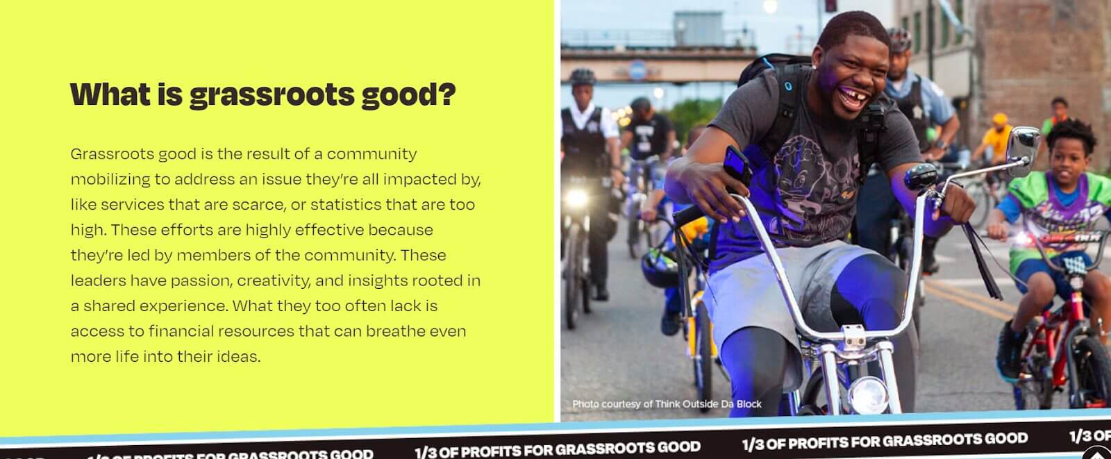
Toms Grassroot Good
The social and economic disruption resulting from the pandemic is truly devastating. A crisis of epic proportions and rare disaster, the virus has put corporate social responsibility to the test. The ways that brands respond to a once-in-a-century global crisis will have important repercussions for their productivity, customer reach, and balance sheets.
The Role of Businesses in Recovering the Economy Showcased Through Website Designs
Businesses have an important role to play in helping world populations through troubled times. It is important to show solidarity and empathy and let customers know what brands are doing for their communities and employees.
Some businesses are paying bonuses to front-line staff. Others are helping children in impoverished neighborhoods who no longer get a school meal. Still, others are donating 100 percent of their proceeds to charitable causes.
Customers also expect that brands play an important role in addressing the challenges we face. In fact, 63 percent of consumers believe that companies should be supporting environmental and social issues during the pandemic (Porter Novelli)
In light of customer expectations, we are likely to see more imagery, visualizations, and designs aligning with ethical and social issues. The best eCommerce web designs focus on community involvement and sustainability and resonate with consumers in times of suffering and continued global uncertainty.
Final Thoughts on the Best eCommerce Website Design

eCommerce Website Design
What constitutes the best website design is changing in response to changing consumer behavior and the digital landscape. The world that we used to live in is gone because of the devastating effect the pandemic has had on populations worldwide.
As we are still largely confined to our homes and neighborhoods, virtual reality helps us beat social isolation. The fact that we are living virtual lives has important implications for brands, whether working online partially or wholly.
In return, that means that the demand for quality is at an all-time high, and this also applies to the best eCommerce website design. What brands should do is raise their standards to be able to “navigate a newly sensitive society, even when the world is in recovery (Accenture). When brands are not sure which choice is right, employees, consumers, and society at large will help lead the way.

