Want a heads up when a new story drops? Subscribe here.
With the unfolding of a global disaster, the world slowing down, the rise of telework, and gallons of hand sanitizer used, 2020 was tough for everyone. But catastrophes of this magnitude have a revelatory potential and shed light on how we can adapt and improve. This time both transformed our lives and provoked the development of new trends- in web design included.
Table of Contents
Time to Up Our Web Design Skills
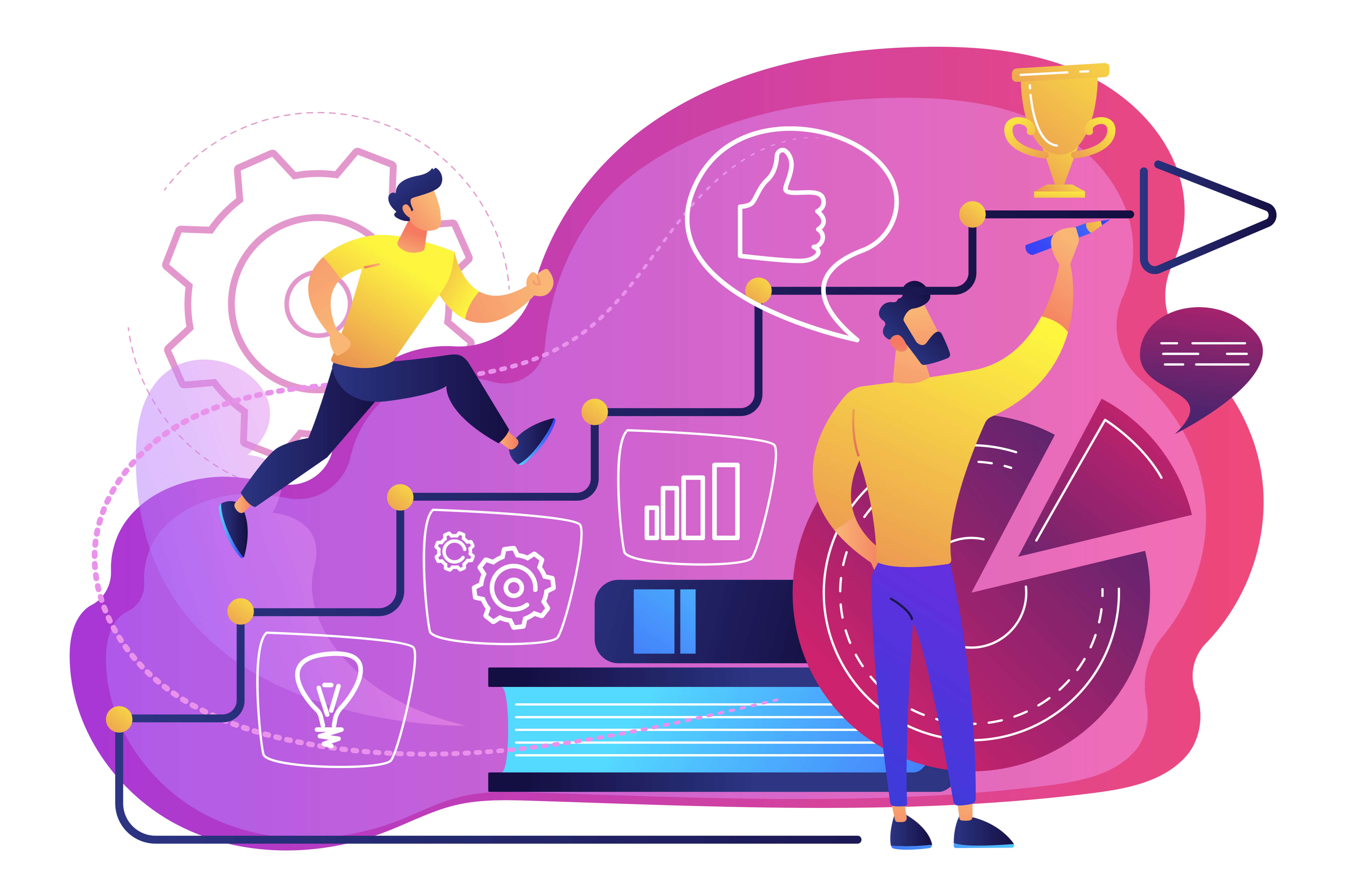
Despite the circumstances and new level of anxiety that Covid-19 introduced into our lives, we did our best to move forward. Some staged scenes in their front yards for Christmas while others embraced summer staycations. Some of us just made sourdough bread, filmed TikToks, and played read-at-home bingo with the kiddos. And many of us learned new skills, some of which totally useless. We all have our coping skills to deal with stressful situations.
Some of us also took the time to build new job skills during quarantine. We kept an eye on the newest cool design trends to wow everyone with a great first impression. We also put together a list of some of the coolest web design trends in 2022 that will give your website some love and a brilliant aesthetic.
Top Web Design Trends in 2022
Neumorhism As a Web Design Trend
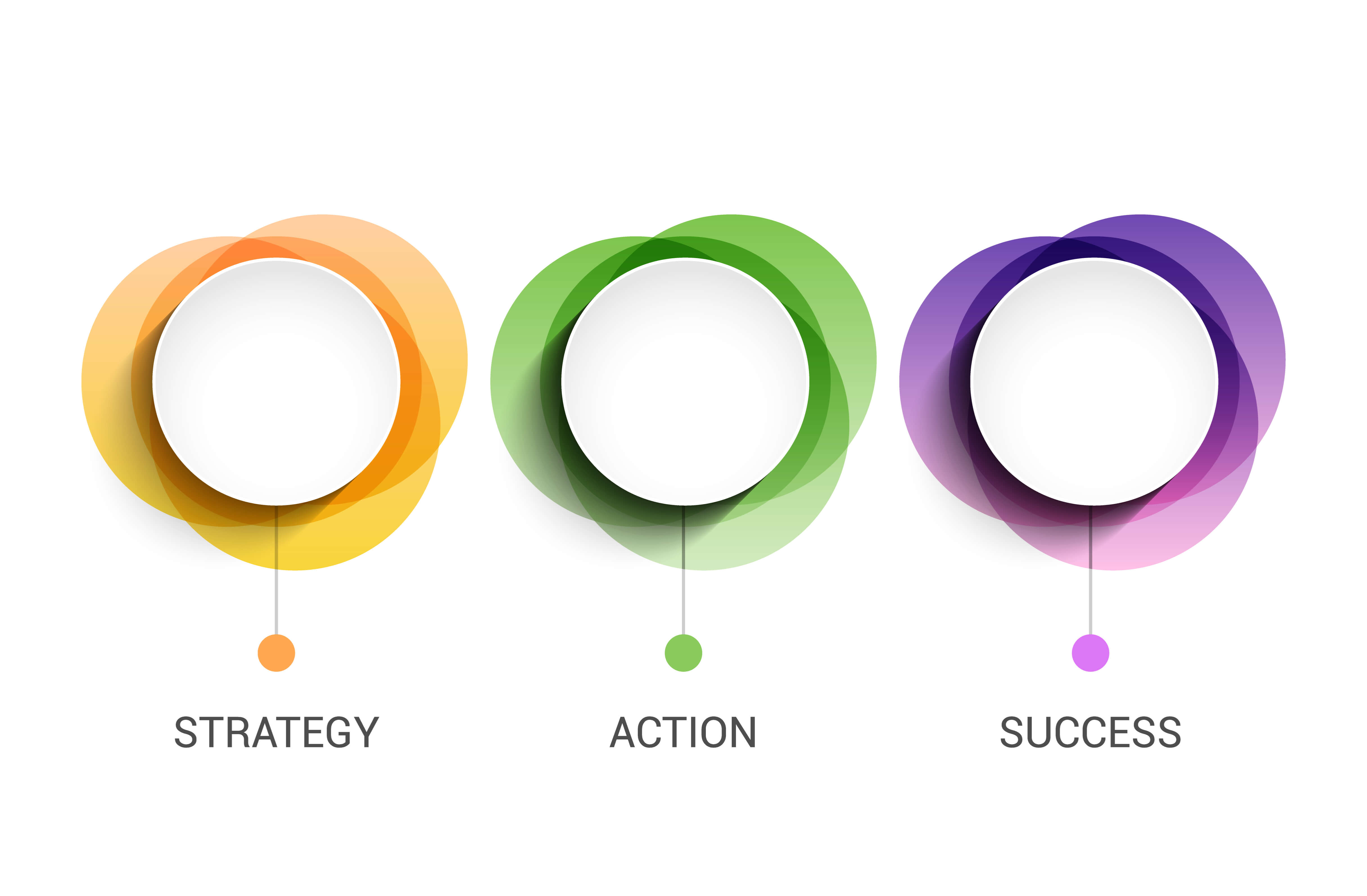
A trend that has gained a lot of attention recently, neumorphism is a new version of a style of designing screens, frames, and web elements known as skeuomorphism, which is about imitating real-life.
With neumorphism, objects look lifelike enough to immediately tell what they are but they remain in the virtual domain. The focus is not on similarity or contrast between the digital and real object but on the use of color to create a unique user experience.
This style is about the play of shadows, low contrast, solid colors, simplified icons, and flat design. Also called soft UI, neumorphism brings clean surfaces to life and gives the interface a new feel by combining highlights, gradients, shapes, and background colors.
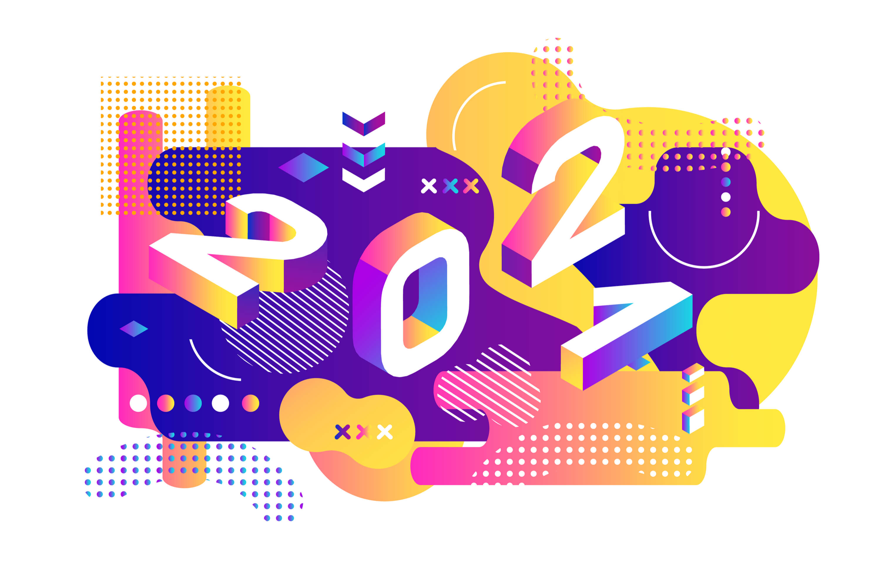
Abstract Psychedelia As a Web Design Trend

Psychedelic art is inspired by the counterculture, art, and music scene of the 1960s and is characterized by the use of bright colors, chaotic imagery, and surreal or distorted visuals that convey psychedelic experiences. It is an artistic attempt to portray the inner world of the human psyche and to free the artistic process through visual and graphic depictions.
Psychedelic art emerged out of a broader movement engendered by a commitment to social and political change on part of the baby boomers. The protests against consumerism, war, segregation, and the values of their parents were followed by a turn to deeper experiences and eastern spirituality.
Today abstract psychedelia is one of the most commonly used styles in popular culture, brand advertising, and is among the top web design trends this year. It features intricate abstractions, excessive use of color, hidden messages, and swirling patterns. Its legacy is an emphasis on complexities, ambiguity, nuances, and engagement on an intuitive and transcendentalist level.
Intelligent Chatbots As a Web Design Trend
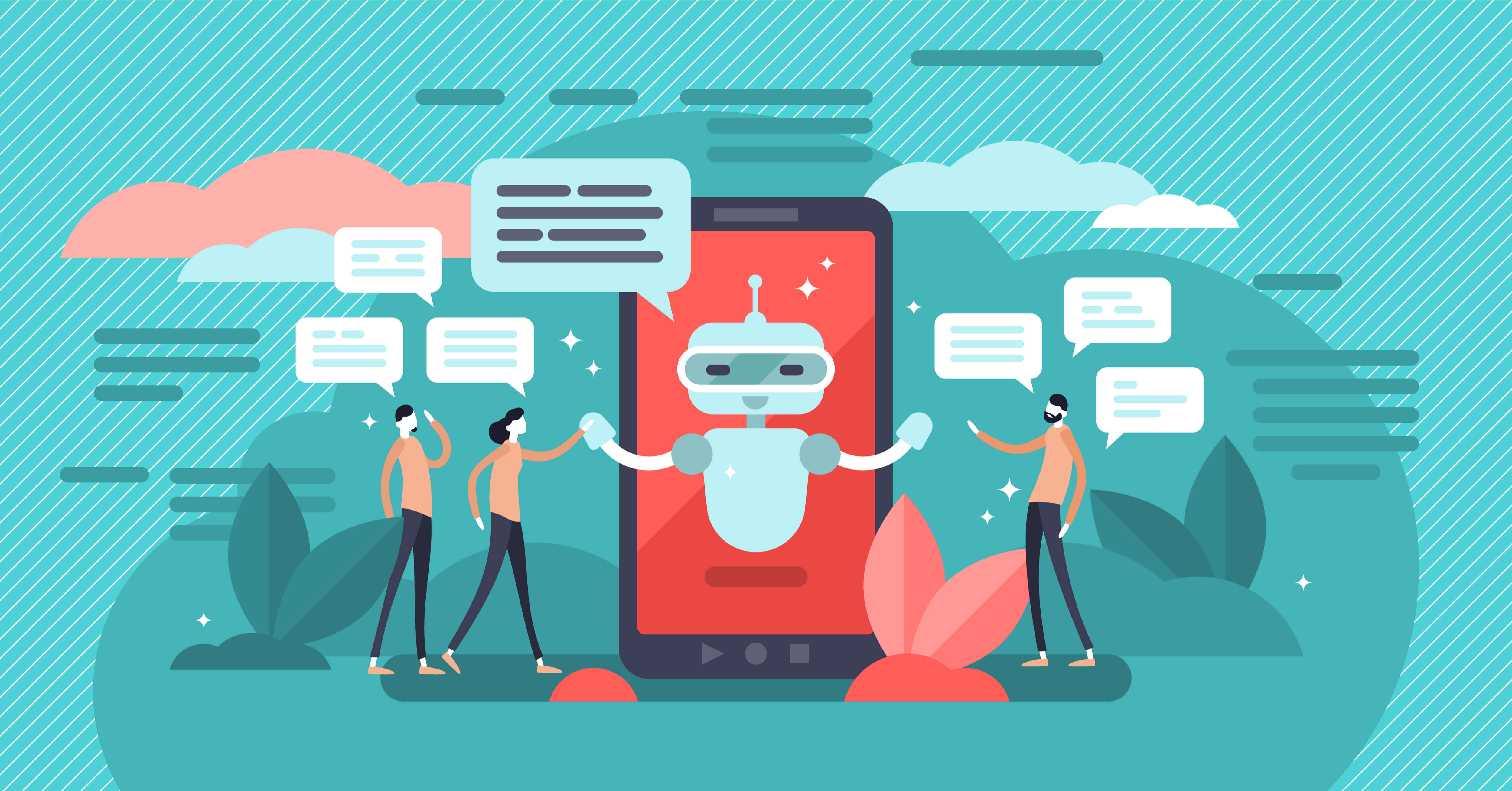
Conversational agents or AI-powered chatbots are becoming more common in customer service. They help users book tickets, answer inquiries and questions, and provide guidance and direction.
Businesses use chatbots to offer product suggestions based on style, color, and preferences and to provide recommendations on location, price range, etc. Chatbots will also start to feel more human-like, intuitive, and capable of carrying predictive real-time conversations- as deep learning and artificial intelligence continue to develop.
In 2022, we expect more AI-driven, to become the norm for things like customer service, personal finance assistance, money transfers, investment management, and with that a solid part of the web design trends of 2022.
When it comes to consumer preferences, a poll by AI Multiple shows that most people would use a conversational agent to get a quick answer in an emergency (37 %) and resolve a problem or complaint (35%). Other common uses are:
- Paying bills (29 %)
- Making a reservation (33%)
- Finding human customer service agent (34 %)
- Finding detailed explanations or answers (35 %)
- Ideas for purchases (22 %)
- Buying a basic item (27%)
Interactive Elements As a Web Design Trend
Another trending web design this year is the interactive elements. You can add them to sections of your website as a great way to engage with customers, and turn them into active participants. An interactive element is anything that is clickable, for example, online calculators, surveys and polls, quizzes, and contests. Examples are also social sharing buttons, interactive animations, virtual product testing, infographics, and forms.
Virtual Reality As a Web Design Trend
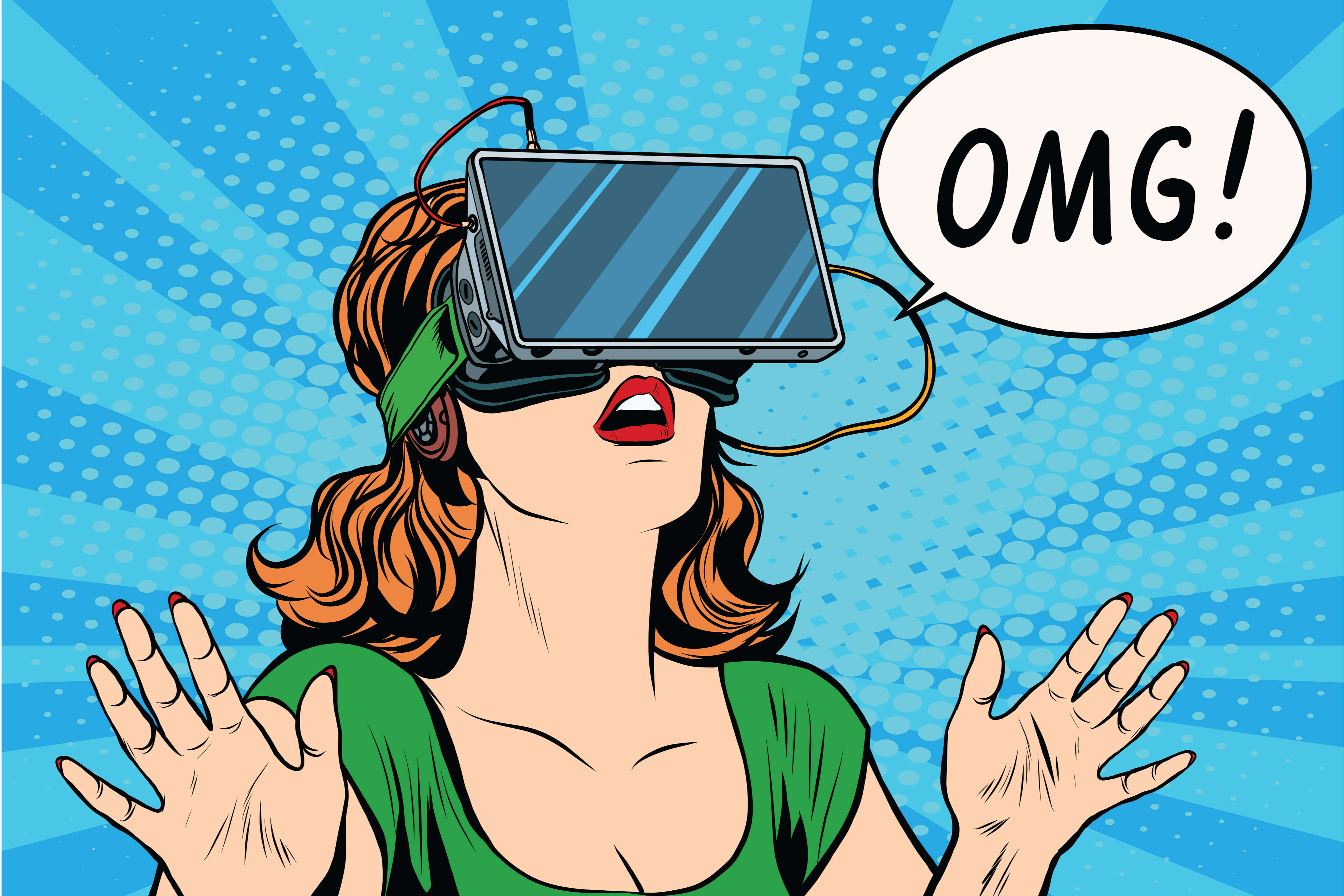
VR will continue to see a lot of traction, as part of the web design trends of the coming years. Think of Hubs by Mozilla, for example. It is a virtual social space where you can set up a floating robot avatar and get together with friends or coworkers. The platform allows you to perform actions like watching videos, moving around maps, and dragging 3D models, links, and PDF files into your shared space.
Bear 71 by the National Film Board of Canada and Jam3 is another example of virtual reality work portraying the Planet Earth of the future.
Bear 71 is a blend of a VR experience and nature documentary that has received numerous awards. Amon which are the Sheffield Innovation Award and Gold Cyber Lion Award. It’s a groundbreaking VR experience featuring a grizzly bear and allowing you to explore the 3D terrain, follow the life of the titular grizzly bear, and encounter wired creatures in abstract shapes.
Besides offering viewers a truly immersive experience, Bear 71 is a documentary that highlights the disconnect between humans and their environment caused by technology and urbanization.
Color to Evoke Emotions As a Web Design Trend
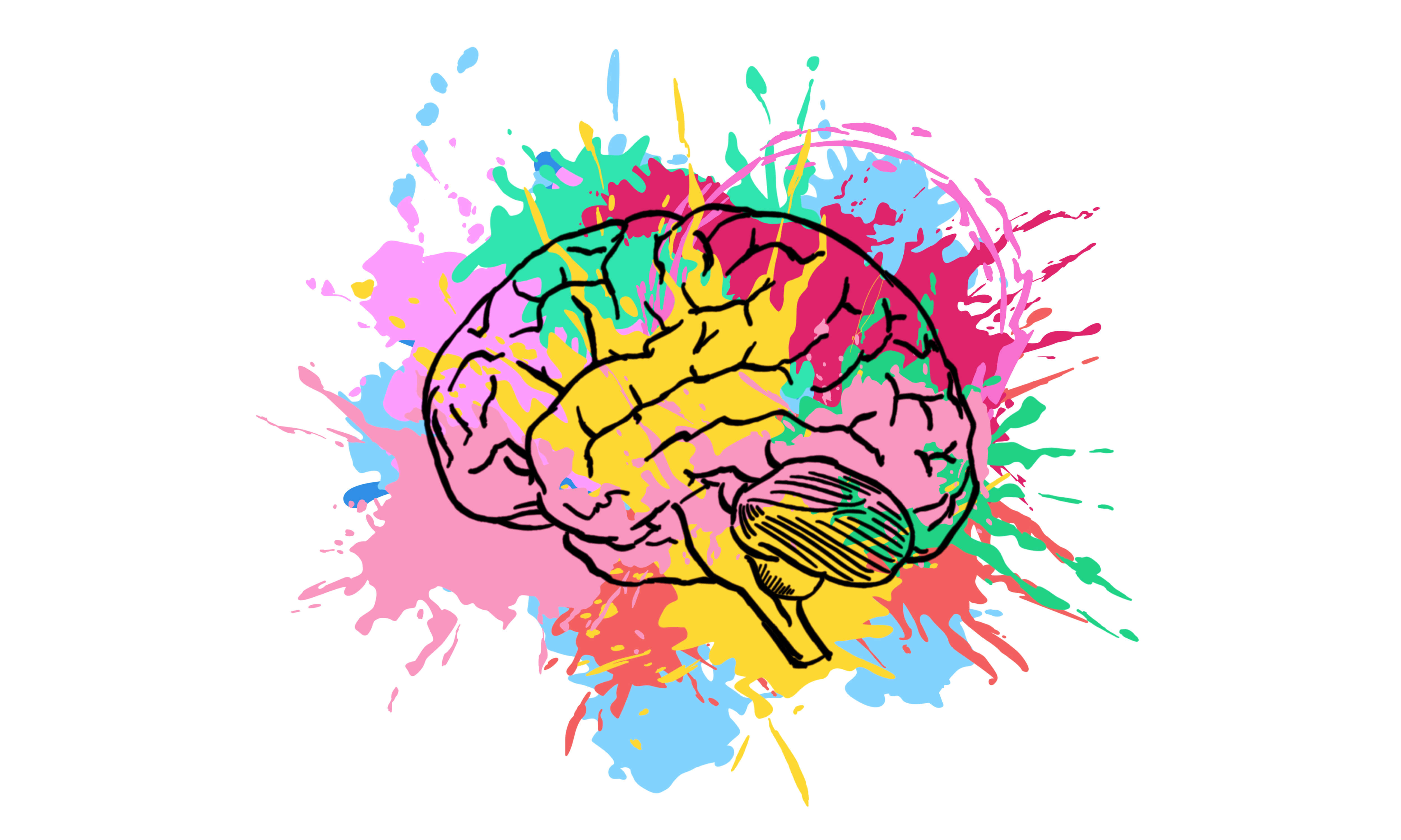
Using color to evoke certain moods and emotions is a prominent web design trend in 2022. According to color psychology, this is a powerful tool to trigger physiological reactions, influence mood, and spark a variety of emotions.
Some effects of color have been shown to have a universal meaning. Red, for example, associates with energy, love, strength, and excitement while orange signifies sociability, bravery, success, and confidence.
Green is the color of freshness, healing, and nature while blue is the hue of competence, loyalty, peace, and trust. Green is commonly used by sustainable and environmentally friendly companies and by some financial brands.
Blue is associated with reliability and many financial industry companies use blue as the color of dependability and honesty.
Purple implies sincerity, compassion, imagination, and spirituality. It can be creative, visionary, and artistic, or impractical and immature. Many brands use purple to showcase a premium service as it suggests extravagance, luxury, and wealth.
Yellow is associated with cheer, warmth, happiness, and creativity and offers fun, happiness, and hope. It is commonly used by brands to capture attention and create a sense of energy, vitality, and excitement.
While our perceptions of color have a lot to do with cultural differences, experiences, and individual preferences, colors evoke either warmth or a cool feeling. Cold colors such as blue and green spark feelings of calmness, restfulness, and even sadness while warm colors evoke feelings ranging from anger and hostility to warmth, peace, and comfort.
In 2022, we will see more designers using color to evoke feelings and moods that a website and brand intend to elicit.
Font Psychology As a Web Design Trend
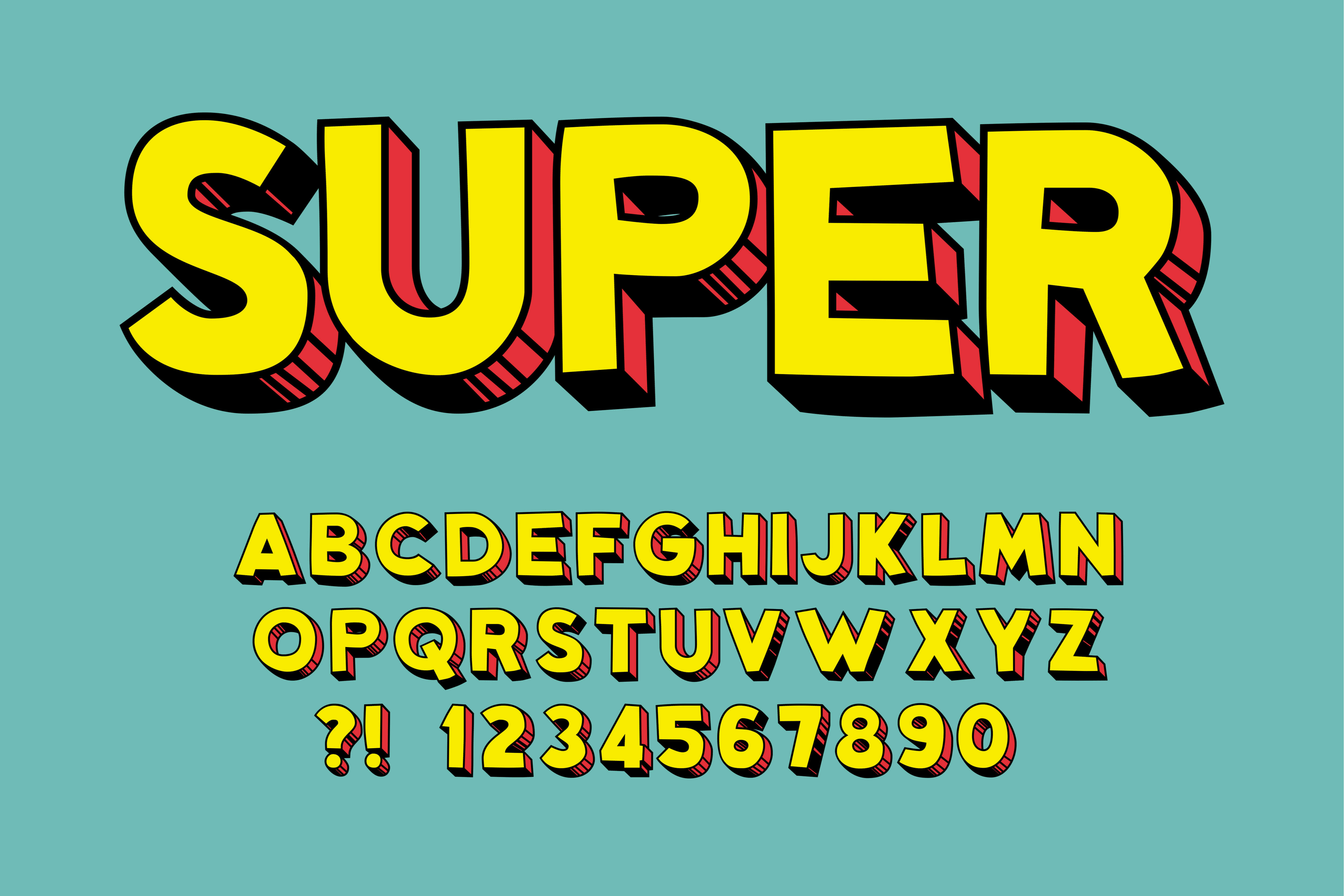
You may already be familiar with the impact of color on human behavior, what you may not know is that different fonts impact our behaviors, feelings, and thoughts differently. Choosing the right font for your website, logo, poster, or cover photo gives you control over how your brand and product are perceived.
For example, if you need a website to promote your financial services company, you want to evoke feelings of stability, trust, and dependability in your audience.
On the other hand, if you choose a script or graphic font, your website will feel a bit too casual. You can use Libre Baskerville instead as it is a serif font perceived as the most trusty by consumers. That is why, accounting firms, insurance companies, brokerage firms, banks, and other financial providers often use this font.
If you are designing a poster, logo, or website to promote your personal training business, you can choose from a variety of sports fonts such as Insurgent, Strikeout, Heisman, and Scout. A traditional serif font can be ideal for a finance company but it won’t spark the kind of excitement that you need for your personal trainer business.
As part of the more significant web design trends, this year, we’ll see a lot of websites using heavy fonts to provide emphasis and instant awareness of their message. Combining neutral colors with large, heavy fonts is a way to focus attention on headlines and demonstrate the visual hierarchy on your website.
Data Visualization As a Web Design Trend
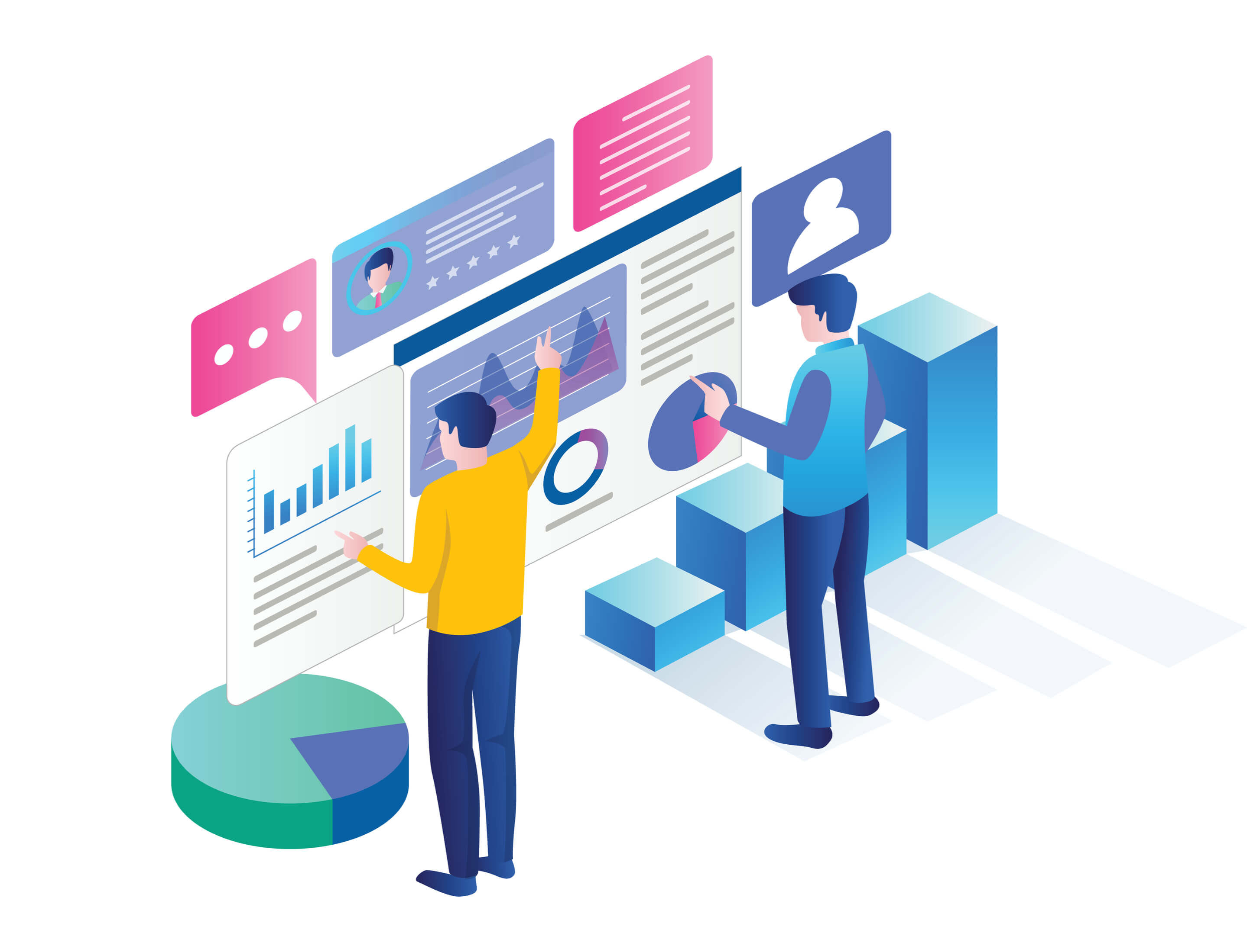
Engaging people with data can be a struggle unless you communicate through an accessibility lens.
Luckily, there are plenty of ways to engage visitors with data such as graphics, infographics, and maps which make visitors want to engage with your brand.
Other types of visualization are dashboards, tables, charts, and diagrams as well as more specific varieties such as:
- Highlight table
- Heat map
- Gantt chart
- Dot distribution map
- Circle view
- Cartogram
- Bullet graph
- Bubble cloud
- Boxer-and-whisker plots
- Bar chart
- Area chart
Data visualization tools make it easier for visitors to understand patterns, outliers, and trends in data. They can literally absorb information at the glimpse of an eye, regardless of how complex it is. In addition to making data easily digestible, visualization tools catch the eye of visitors and compel them to stay longer. Our eyes like patterns, shapes, colors, and movement. We can quickly tell a circle from a triangle, tall from short, and green from orange.
Visual culture permeates our society. We are virtually bombarded with imagery in our daily lives, from movies and TV to advertisements and art. We are exposed to a plethora of cultural and social constructs. Video games, billboards, magazines, and social media, have a profound impact on how we view the world and ourselves.
Data visualization is a form of art that helps visitors pay attention and keeps their eyes on the message. When you see a graph, for example, you are quick to spot relationships and trends. Charts and graphs offer multiple benefits – they show clusters, gaps, comparisons, and trends that allow us to quickly draw conclusions.
And if we can see something, we can better internalize, memorize, and retrieve it. This is a form of purposeful storytelling. It tells stories by presenting information in a way that is easy to comprehend. In essence, data visualization brings data to life.
Tip: Hundreds of growing businesses use Socialfix to create awesome web designs and showcase their products.

Dark Mode As a Web Design Trend
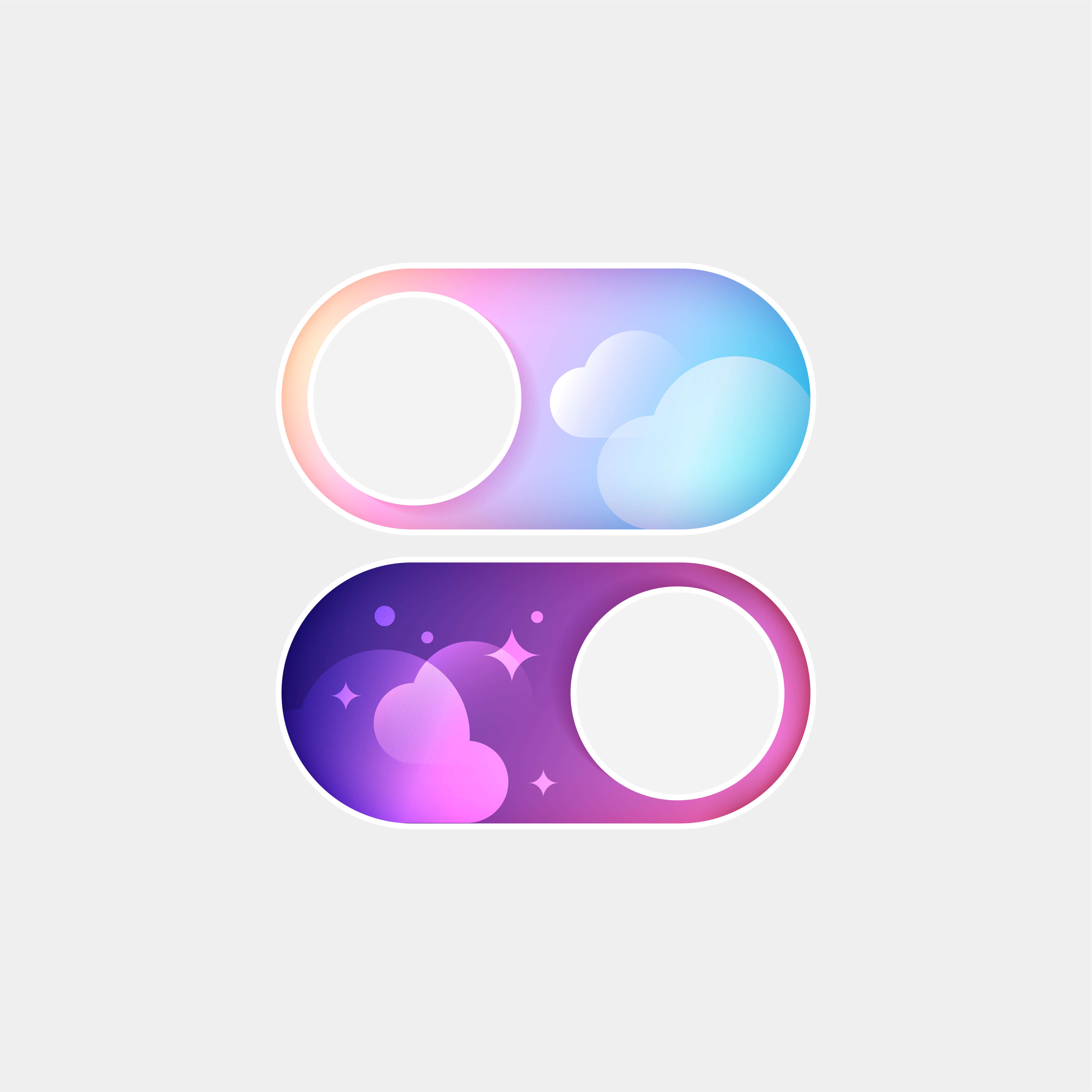
Many web designers like to dim the lights and for a good reason. Dark mode increases the contrast between text, images, and backgrounds and gives designers more options to experiment with color palettes. Some colors such as pale mint, pale seafoam, and light blue are more difficult to view on a white screen.
The dark mode also reduces eye strain and extends battery life. On the aesthetic end, dark mode makes image-heavy websites look more professional. It gives them that ultra-modern look that appeals to younger generations. Besides, younger people prefer dark color schemes, especially the ones who play a lot of video games.
Final Thoughts
There are plenty of great ways to improve your website’s functionality and appeal. Data visualization, interactive elements, and the use of colors, and fonts, for example, evoke the right mood or emotion. Utilizing design trends is a great way to stay ahead of the game. They add extra impact to your marketing and brand.
It is important to differentiate trends from fads, however. Otherwise, you risk jumping on the bandwagon after everyone else had already joined the ride. Make sure you utilize trends that will stand the test of time. Combine trends with your brand only when they can significantly improve customer perception.
